 A univariate choropleth map, maps one specific variable and breaks the values up into color coded classes to portray the population or percentage in each area. In this map they are looking at the hispanic or latino population in Florida. Most of the hispanics live in South Florida and as you travel north the population gets less and less.
Friday, April 24, 2009
Univariate Choropleth Map
A univariate choropleth map, maps one specific variable and breaks the values up into color coded classes to portray the population or percentage in each area. In this map they are looking at the hispanic or latino population in Florida. Most of the hispanics live in South Florida and as you travel north the population gets less and less.Sonar Map
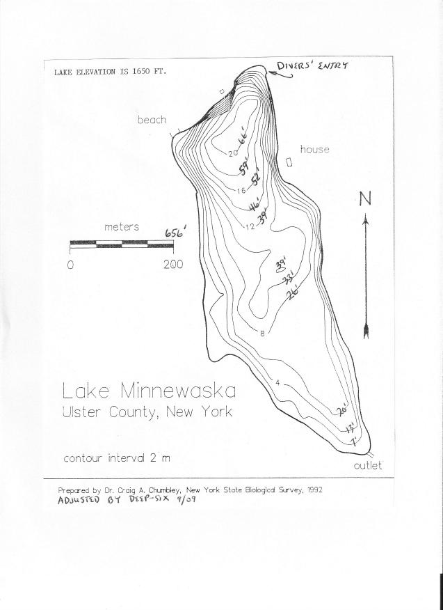
Sonar Maps are used to show depths of water and can be used to show what is located on the bed of the body of water. This is a map of a lake and inside the contour lines they show the level of the water. You can see that it is almost a reverse cliff because if all of the contour lines were going up it would make a cliff, but because each circle goes deeper and deeper, there is no cliff. The deepest part of this lake is in toward the top of the map.
Mercator Projection

A mercator projection is a head on from the side projection of the blog. It would be as if you cut a slice down the middle of the globe from the north to the south pole and rolled the map out as if it were a cylinder. This is a mercator projection of the whole earth and you can see that it is a dead on view as if you are looking ath the globe from the side.
Continuously Variable Proportional Circle Map

This is a Continuously Variable proportional circle map. In this map the provide a key and estimate circles inbetween the key. No circle is the same size on this map unless they have the exaxt same value. This is opposite from the range graded proportional circle map becasue they have specific circle sized that represent a range. In this map you can see the mexican population is biggest in Texas, California, Nevada, and Arizona. That is becasue those are all the states on the Mexican border.
bivariate choropleth map
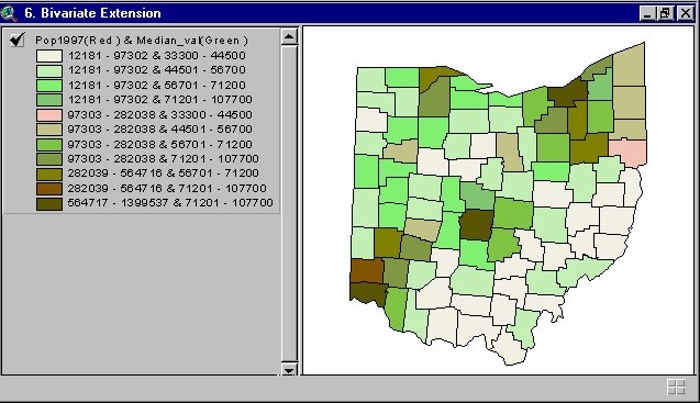 A bivariate Choropleth map shows two different sets of variables on the same choropleth map. In this map each color represents two different sets of numbers. For each color there is a smaller set of numbers which is the population of 1997 and a larger set of numbers which is the median value.
http://proceedings.esri.com/library/userconf/proc99/proceed/papers/pap171/p171.htm
Resource Map
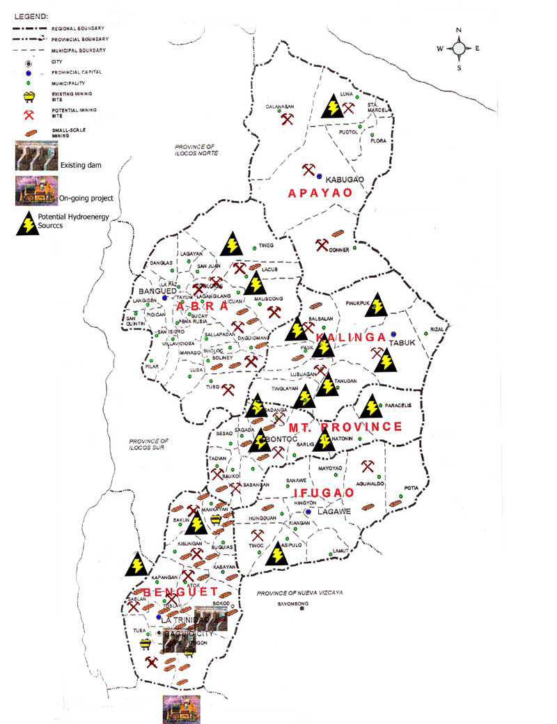
This resource map is a planimetric map that exposes where resources are on the land. These maps are helpful to lock at when you are lookign for a specific resource. Different pictures and the map legend are used to show where specfic resources are. There are lots of different available spots on this map for mining which is what is most likely done often on this land.
Thursday, April 23, 2009
Star Plot
 A star plot is used to show many observations on one chart. In this star plot they examined different types of cars and each piece of the star represents either price, mileage, repair record, head room, seat room, trunk space, weight, and length. From looking at the stars you can compare 16 different types of cars and decide which one sounds most appealing to you.
http://www.6sigma.us/handbook/eda/section3/starplot.htm
Correlation Matrix
 A correlation Matrix looks at the correlation between all the variables on the graph. Once again, like the similarity matrix you find the square that intersects the axis of the two numbers you choose and then match the color of the square to the correlation table.
Similarity Matrix
 A similarity matrix uses boxes with different colors or patterns in them to show similarity. It is similar to a multiplication table where you take the numbers on the axis of the graph and follow the row until they meet and that is the answer. On this graph you take the number on the x and y axis and follow till they meet and it shows how similar the strain is. For example, take 10 on the y axis and 5 on the x axis and it says that they have 70-79 percent similarity.
http://www.jbaas.com/articles/vol_2_n2_c7.php
Stem and Leaf Plot
 A stem and leaf plot is used to show all the values you want to show on one table. The stem is the 10's column and the leaf is the 1's column. So if the stem has a 3 and the leaf has a 2, the number is 32. This is a graph showing the ages of all the people at the family reunion. you can see there were a lot of young kids, and a lot of people in their thirties.
http://www.eduplace.com/math/mhm/5/06a/index.html
Box Plot
 A box plot is a plot based on averages. The line inside the box represents the median. The two lines at the beginning and end of the graph are the smalled and larges value. To get the two ends of the box you have to take two different means. You take the mean of everything between the median and the lowest value to get the left side of the box, and the mean of everything between the median and the highest value to get the right side of the box. From this graph most of the snow depth is between 50 and about 105. The most snow they got was about 125 and the least snow they got was around 30.
http://edubuzz.org/blogs/nbhs3x1/2007/01/08/8-jan-2007-five-figure-summary-and-box-plots/
Histogram
 A histogram is useful to see how different groups interact with one variable. In this graph they are looking at what percentage of smokers are in each age group. This is divided between age and sex. For the female group the most smokers are between the ages of 25 and 34, and most smokers are under 65. In the male group most smokers are between the ages of 25 and 44, and again most smokers are under 65.
http://math.youngzones.org/stat_graph.html
Parallel Coordinate Graph
 A parallel Coordinate Graah is used to show several different variables and how they interact. In these types of graphs they look for intersections to find relationships. In this specific graph they are looking at airplanes leaving at different times to different locations trying to see if they will collide.
http://www.caip.rutgers.edu/~peskin/epriRpt/ParallelCoords.html
Triangular Plot
 This is a triangular plot of the three major parties voting for parliment in the UK. The colored areas represent the different parties and the percentage of the vote their party will take up. The white circle in the red section represents where the opinion poll result is located. From the looks at this graph the red seems to be taking up most of the vote.
http://ex-parrot.com/~chris/wwwitter/20050407-it_doesnt_matter_how_you_vote_either_way_your_planet_is_doomed.html
Windrose
 This wind rose uses color to show the different wind speeds in each direction. From the look of this wind rose the fastest windspeeds measured in knots are going toward the south because it is the longest bar and at the end of the bar it is green in color.
http://www.climate.washington.edu/climate.html
Tuesday, April 21, 2009
Climograph
 A climograph is obviously a graph that follows the weather and climate. In this specific map the follow rainfall, temperature, and the summer and summer and winter solstice schedule. In this map there was very little rain in Jan, Feb, and Dec, and a lot of rain in July and August. The temperature ranged from 70 in the winter to about 85 in the summer.
http://www.sci.uidaho.edu/scripter/geog100/lect/06-climates/low-lat-climates/7-12-climograph-tropical-wet-dry.jpg
Population Profile
 A population profile is used when there is a curiosity about speicific things within a population such as age, hair color, or sex. In this population profile they are looking at the growth and decay of age in the Tasman District of New Zealand. As you can see, it seems that more and more people moved to New Zealand because as the years went up so did the population in most age groups. The only age groups when the population went down is the 15-24 and the 25-34.
http://www.tdc.govt.nz/pics/795-Page-6.jpg
Scatterplot
 This Scatterplot shows the relationship between annual temperature and elevation in Nevada. In this you see that as the elevation gets higher the mean annual temperature gets lower.
http://argyll.epsb.ca/jreed/math9/strand4/scatterplot1.gif
Index Value Plot
 In this index value plot they are testing the level of stocks from November of 1995 to January of 2006. As you can see the levels pretty much stay between 1000 and 2000 for most of the time but its starts going way up january of 2006.
http://www.galatime.com/images/2006/nifty_atr14_percentage.png
Bilateral Graph
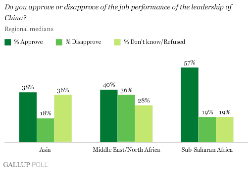 This is a bilateral graph surveying peoples opinions of the leadership in china. A bilateral graph is a graph that shows two or more variables that are similar on the same graph. On this graph the different countries have three options: approve, disapprove, and no opinion. In Asia, more people approved than disapproved. In North Africa and the Middle east it was pretty steady between who approved and disapproved. In Sub-Saharan Africa more people approved and disapproved.
http://media.gallup.com/poll/graphs/080429China2Graph2_GASJIDHUQfredo.gif
Geopotential Heights Map

Isohyet Maps

This is a Isohyet map of New Zealand. The Contour Lines are in 50 millimeter intervals which means that from one contour line to the next there is a 50 millimeter difference in rainfall. As the circles get smaller inside each other the rainfall amount increases. In February of 2009 the most amount of rainfall was near the coast between Inglewood and Manaia.
Isotach Maps
 Isotach maps use contour lines to see wind speed. This is an Isotach map of Florida showing the windspeeds during a category 4 hurricane. As you can see in the south towards Miami the windspeed is at its highest, where the hurrican would generally hit. As you get towards northern central florida the contour lines close in and the windspeed gets slower.
http://ics-sips-fl.com/Solutions/Hurricane.htm
Isobar maps
 Isobar maps use contour lines to track air pressure. This is an isobar map of europe and in this map you can see that in southern europe there is a low pressure with the air pressure concentrating around Italy and Turkey. There is also a high pressure in north western europe where there is also a concentration of air pressure. You can also see that as the Isobars concentrate around the Low pressure, the barametric pressure of each bar goes down. In the high pressure zones, the barametric pressure on each bar goes up.
http://www.windfinder.com/weather/
LIDAR
 LIDAR photos use lazer lights shooting down onto a specific piece of land to create maps based on the stimulated emission of radiation. This specific map seems to be of a coast line and also uses topographic mapping techniques and contour lines to show elevation.
http://www.treehugger.com/files/2007/06/3-d_forest_mapping.php
Doppler Radar Map
 Doppler Radar is used to track weather and see what kind of weather is coming. It also tells us when that weather is coming. This is a still photograph of what the doppler radar would look like. This is a Doppler Radar map is showing new england and the expected rainfall that is coming.
http://www.xenodochy.org/diogenes/weather.html
Black and White Aerial Photo
 This is a Black and White Aerial Photo of Liverpool, UK. A black and white photo is taken by a camera off the bottom of an airplane and it is uses to see what a specific area looks like from far away so that you can see the area as a whole. An aerial photograph can help to aid a cartographer into generating other types of maps.
http://www.culture24.org.uk/places+to+go/north+west/liverpool/art28314
Cartographic Animations

Cartographic Animations make it possible to see many different maps at the click of a mouse. This map shows Classed and Unclassed choropleth maps of death rates of different diseases such as Cancer, Heart Disease, Chronic Lung disease, and Cerebro-vascular disease in Nebraska. By running your mouse over the different colored squares the map changes.
Statistical Map

A Statistical Map is a map that shows quantities of different things. This specific map is showing the crime and burglary rate from 2001 to 2002 in Denver Colorado. This also uses choropleth qualities because it breaks the crime rates up into color coded classes.
http://www.denvergov.org/2001_crime_stats/Burglary/Burglary2/tabid/377611/Default.aspx
Cartograms
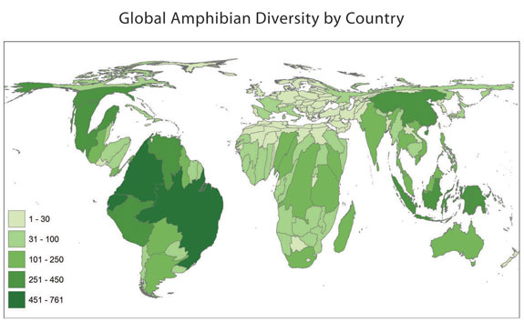 A cartogram is a thematic map that shows one variable usually referring to area or distance. This specific map is also a choropleth map breaking the area up into classes and colorcoding each class. This map is a map showing the Amphibian population in the world.
http://amphibiaweb.org/amphibian/cartograms/
Flow Maps
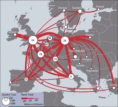
This is a flow map of the telecommunication minutes used in europe between countries. This flow map also uses the proportional circle technique in each country. The flow map uses lines to show the traffic between each country and the thickness of the line shows how many millions of minutes of communication there is. The thicker the line, the more communication. The circles represent the total outgoing communication from each country.
Monday, April 20, 2009
Isoline Map
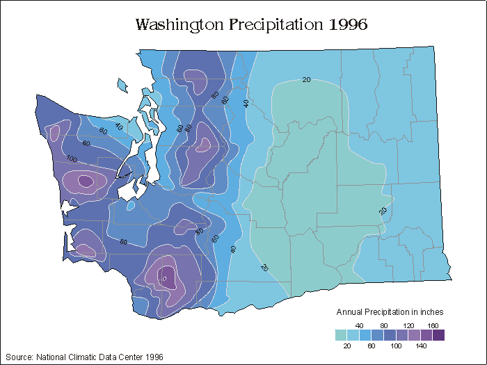
Isoline maps use contour lines and color changes to show what they are trying to show. In this map they are showing annual precipitation rates in washington. From the scale you can see that the darker the color the more rainfall, in inches, there was.
Proportional Circle maps

A proportional circle map uses circles to show the information they are trying to show such as populations. In this map they are using different sized circles to show the american indian populations in each state. The larger the circle, the larger the population.
http://www.neiu.edu/~nerobert/Cartography.htm
Dot Distribution Maps

Dot Distribution Maps use dots to show what they are trying to show. In this specific map they use Dots to show population. This is the population map from the 2000 census. This map is depicting what the nation would look like form space at night if lights were turned on. Each white dot represents 7500 people
Propaganda Maps
 A propaganda map is a map that is drawn or exagerated to make people believe what they want them to believe. This map shows the housing foreclosures in chicago. The first map is the foreclosures in 2006 and the second is in 2007. The propaganda in this is that the red squares aren't to scale. The article this map came from said each square would scale to about 400 feet. That is a bit exagerated from an actual house. So the exagerated red squares make it it seem like there are foreclosures everywhere in the huge red spots.
http://www.infonaut.ca/blog/?p=197
Hypsometric Maps

Hypsometric maps show elevation. They use a graduating color scale to show the different height of each area. As the colors fade lighter in this map the elevation goes higher. This is Hypsometric map of France
PLSS Maps
 PLSS map uses meridians such as longitude and latitude lines to separate different areas in the country. PlSS separates that for things such as land partioning and ownership. This map is a PLSS map of Franklin county alabama.
http://www.rootsweb.ancestry.com/~alfrankl/land.html#link4
Cadastral maps
 Cadastral Maps show land and how it is divided between ownership. Generally they are slip up into different plots of ownership but sometimes they also include what each section is and who owns it and what the specific street boundaries are that separate the land. This map divides up the ownership of delaware county.
http://www.dalisproject.org/(S(psxv4145exrijq45cq4nue45))/pages/findMapsheet.aspx
Thematic Map
 A thematic map is a map that sticks to an underlying theme in what it shows. Most maps are thematic because they have a theme and a purpose. They might show rainfall or population. In this specific map they are showing the specific land reserves of Hawaii.
http://www.creativemappingsolutions.com/maps/thematic/thematic1.html
Unclassed Choropleth Maps

An unclassed Choropleth map is similar to a classed choropleth map in that it divides an area into different groups and then colors it in to show differences in things such as population or rainfall. The difference however, is that an unclassifed map does not divide into quadrents meaning red equals 1-5, blue equals 6-10. Unclassified maps use a constant darkness scale that changes each individual percentage with a change in darkness or color. This is an Unclassifed choropleth map showing the mortality rates in Europe.
Classed Choropleth Maps
 This is a classed choropleth map of the united states showing how many males per 100 females are in each state. A classed choropleth map breaks up the subject of the map into sections and then divides it using a class system. In most of these maps the class system is broken up into colors. In this map there are four color classes that are set up separating different amounts of people.
http://my.ilstu.edu/~jrcarter/Geo204/Choro/
Digital Raster Graphics
As the notes say, a Digital Raster Graphic is a topographic map which is a scanned image of the U.S. Geological Survey. This is a DRG of the Chicago area in Illinois.
Digital Line Graphs (DLG)

This is a DLG map of cape Hatteras. DLG graphs are flat maps that use vectors to show different things on maps. In this map the vectors are use to show rivers, state lines, and county lines.
Digital Orthographic Quarter-Quads (DOQQ)
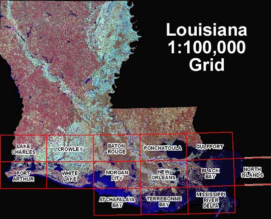 This is a DOQQ map of Louisiana. As the notes say, a DOQQ combines the qualities of an aerial photo with the geometric qualities of a map. With DOQQ maps an aerial photo is taken and then orthorectified to get rid of the distortion and elevation to show a flat map.
http://www.lacoast.gov/maps/2004doqq/index.htm
Digital Elevation Models (DEM)
 This is a Digital Elevation Model for Colorado. Colorado is known for its mountains so a digital elevation model is perfect for this state because it shows the elevation in a high definition way.
http://commons.wikimedia.org/wiki/File:Colorado.png
Wednesday, April 15, 2009
isopach maps

Isopach maps are another type of contour map that shows rock and sediment thickness. This map shows the thickness of the land in the Sand River area of canada. The contour line intervals are 25 meters and the different colors show the different thickness of of the land. The darker the color the thicker the land, as the legend shows.
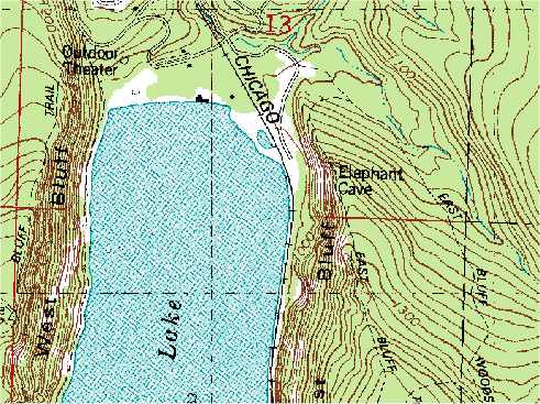
Topographic Maps
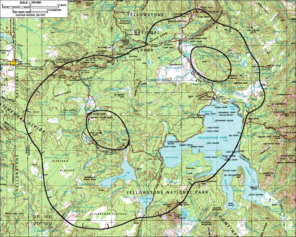
This is a topographic map of yellowstone national park. A topographic map is a type of contour map that uses contour lines to show elevation and shape of areas on the map. The contour lines are usually in a circular for and as the circles inside the circles the smaller, the elevation gets higher. Topographic maps are perfect for showing a 3D image on a 2D surface. In this map you see Yellowstone National Park and the surrounding areas. To show how massive the National Park is, the scale on this is 1:250000 meaning one unit on the map is 250000 units in real life. The contour line intervals are 200 feet so between each line on the map there is a 200 foot elevation difference.
Planimetric Maps
 Planimetric maps are surface maps that are 2 dimentional and show no relief features. This map is a road map of the Lake George area. It shows the bottom left hand corner of Lake George, major roads in the area, and major landmarks such as a boat launch and Fort William Henry. This map is a perfect example of a Planimetric map because it shows a simple overhead two dimentional drawing of the area.
Mental Maps

A Mental Map is a map drawn of someone's memory of an area. Most people can identify with mental maps because we have they have probably drawn one. They are often on party invitations or on a sheet of paper when giving someone directions. Multiple mental maps of the same location drawn by different people will usually look different becasue everyone has a different view or memory of what something looks like. This map is a drawn map of what looks like a town where the cartographer grew up or lived at one point. He includes roads, landmarks, points of intrest, and descriptions of each location.
Monday, January 19, 2009
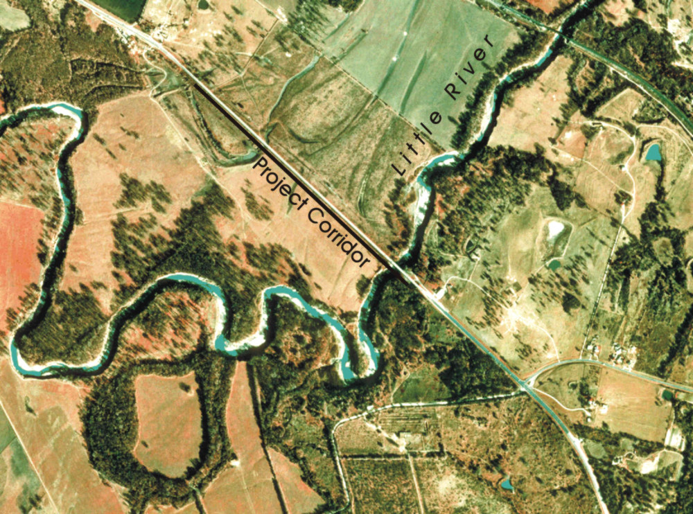
Infrared Aerial Photo

This is an Infrared Aerial Photo. It is showing the channels that cut the Little River Floodplain in Texas.
http://www.texasbeyondhistory.net/jbwhite/images/figure11.jpg
Subscribe to:
Posts (Atom)